Tuesday, April 26, 2011

Image editor for Silverlight

Introduction

If you are creating fun and attractive Web application with animations, graphic and different attractive and fun services, then sometimes you need user to create images online. For example to post it on the page of another user or something like this. This article describes control, that you can use for such purposes. This control is Silverlight 4 based.

My original article with sources to download: http://www.codeproject.com/KB/silverlight/imageeditor.aspx

Application overview

As I said before, this application in attachments contains control, that allow web user to create simple images online. This control doesnt create any JPEG'g or PNGs, but it returns ImageSource to developer, and developer can use this ImageSource for his purposes: create images, backgrounds, etc.
There are following tools and features:
  • Round brush
  • Size of brush
  • Color of brush
  • Brush opacity
  • Clear and undo features
Following screenshot shows you layout of editor:
3.jpg
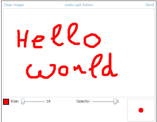
At the top there are Undo and Clear command buttons. Middle is a canvas with image. At the bottom there is color, size, opacity and brush preview.
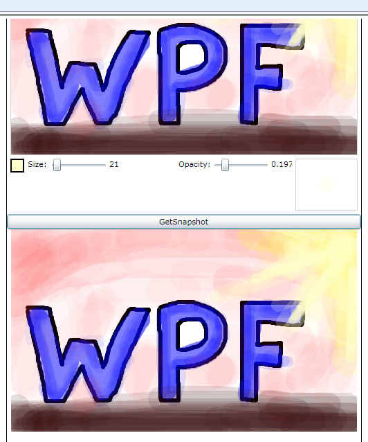
Also, in the application there is button "Get Snapshot" that demonstrate feature that convert drawn image to ImageSource. There is Border at the bottom, which background is that ImageSource. The example of such preview is below:
2.jpg

How to use

This control has following public properties and methods that can be used outside:
  • BrushColor - dependency property. Brush color
  • BrushSize - dependency property. Brush size
  • BrushAlpha - dependency property. Brush opacity
  • Clear() -clear canvas
  • HideTools() -hide bottom tools
  • ShowTools() - show bottom tools
  • Undo() - undo if available
  • GetImage() -get current image
Max count of undoable actions are stored in const maxUndo in EditorCanvas class. If anyone need it to be a property - just do it :)
HideTools() and ShowTools() use animations that are defined in related XAML file.

Code

Lets look into sources.
The first I wanna describe how image is drawn. There are 3 layers:
Collapse
<Grid x:Name="Sheet" Background="White" SizeChanged="Sheet_SizeChanged">
                    <Grid.Clip>
                        <RectangleGeometry />
                    </Grid.Clip>
                </Grid>

                <Canvas x:Name="CursorCanvas" Background="Transparent" Cursor="None">
                    <Ellipse x:Name="Cursor" Canvas.ZIndex="100" Visibility="Collapsed" 
                                 Opacity="{Binding BrushAlpha}" Width="{Binding BrushSize}" Height="{Binding BrushSize}">
                        <Ellipse.Fill>
                            <SolidColorBrush Color="{Binding BrushColor}" />
                        </Ellipse.Fill>
                    </Ellipse>
                    <Path Stroke="Black" Canvas.ZIndex="101" StrokeThickness="1" x:Name="Cross" 
                          VerticalAlignment="Center" HorizontalAlignment="Center" Visibility="{Binding ElementName=Cursor, Path=Visibility}">
                        <Path.Data>
                            <GeometryGroup>
                                <LineGeometry StartPoint="3,0" EndPoint="8,0"/>
                                <LineGeometry StartPoint="-3,0" EndPoint="-8,0"/>
                                <LineGeometry StartPoint="0,3" EndPoint="0,8"/>
                                <LineGeometry StartPoint="0,-3" EndPoint="0,-8"/>
                            </GeometryGroup>
                        </Path.Data>
                    </Path>
                </Canvas>

                <Canvas x:Name="InputCanvas" Background="Transparent" Cursor="None"
                        MouseLeftButtonDown="InputCanvas_MouseLeftButtonDown"
                        MouseLeftButtonUp="InputCanvas_MouseLeftButtonUp" MouseEnter="InputCanvas_MouseEnter"
                        MouseMove="InputCanvas_MouseMove" MouseLeave="InputCanvas_MouseLeave">
                </Canvas> 
 
Sheet - it is a grid that contains geometries that has been drawn.
CursorCanvas - contains brush cursor and cross cursor
InputCanvas - collects all mouse inputs. We need it, because otherwise mouse will be always on the Ellipse (brush cursor) that is inside CursorCanvas and there will no MouseEnters and MouseLeave and MouseMove events.
When user press left button, following code is performed:

InputCanvas.CaptureMouse();

            geometry = new GeometryGroup();
            geometry.FillRule = FillRule.Nonzero;
            figure = new Path();
            figure.Fill = new SolidColorBrush(BrushColor) { Opacity = BrushAlpha };
            Sheet.Children.Add(figure); 
First, we need to capture mouse, to avoid drawing to be finished after user move out of the control. Next, we create path with selected color and opacity and drop it into Sheet. Geometry variable contains geometry that is drawn right now.
When user moves mouse, then Ellipses are added to locations where "MouseMove" event occurs. Ellipses are connected by rectangles. I call this rectangles "connectors". Idea is explained in the image below:
5.jpg
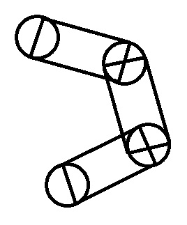
To draw that rectangle I have to know size of ellipses and it's center coords. And I know it. So, it it easy. Following code draws one connector between 2 ellipses:

Point a, b, c, d;
            double x1 = mousePosition.X;
            double y1 = mousePosition.Y;
            double x2 = prevMousePosition.Value.X;
            double y2 = prevMousePosition.Value.Y;
            double l = BrushSize / 2;

            PathGeometry conntector = new PathGeometry();
            conntector.FillRule = FillRule.Nonzero;

            double alpha = Math.Atan2(y2 - y1, x2 - x1);
            double beta = Math.PI / 2 - alpha;

            a = new Point(x1 - l * Math.Cos(beta), y1 + l * Math.Sin(beta));
            b = new Point(x2 - l * Math.Cos(beta), y2 + l * Math.Sin(beta));
            c = new Point(x2 + l * Math.Cos(beta), y2 - l * Math.Sin(beta));
            d = new Point(x1 + l * Math.Cos(beta), y1 - l * Math.Sin(beta));

            PointCollection points = new PointCollection();
            points.Add(d);
            points.Add(c);
            points.Add(b);
            conntector.Figures.Add(new PathFigure()
            {
                IsClosed = true,
                IsFilled = true,
                StartPoint = a,
                Segments = { new PolyLineSegment() { Points = points } }
            });
 
variables a,b,c,d - are vertices of the rectangle that describe connector. And here is one important thing. I waste some time because of it. This important thing is an order of points.Add() commands. For correct geometry filling you have to add point in counterclockwise order! Otherwise filling will works like you use EvenOdd fill method, even if you choose NonZero.
Ok, what we have? Path that contains set of ellipses and connectors. User release left button and we need to process this data. Most easy way is easily remain this Path in the Sheet and draw next figures. But, some users like to draw very complicate images :) So, if there will be a lot of geometry you can get slowdown. Not good. So, I decided to render this Path and set rendered image as a Background of the Sheet. And it shows me good results. No slowdown.
Following method is called when user release leftbutton:

private void EndFigure()
        {
            mouseLeftButton = false;
            InputCanvas.ReleaseMouseCapture();
            prevMousePosition = null;

            Sheet.Background = new ImageBrush() { ImageSource = ConvertToImage() };
            Sheet.Children.Clear();
        } 
 
ConvertToImage() is a method that convert current look of Sheet into ImageSource. It also used in GetImage() method and I wouldnt return to it's descriptions in the future. So, here it is:

private ImageSource ConvertToImage()
        {
            WriteableBitmap bitmap = new WriteableBitmap(Sheet, new TranslateTransform()); 
            bitmap.Render(Sheet, new TranslateTransform());

            return bitmap;
        }
 
Rather easy. Isnt it?
Another thing that I would like to show you - is a color picker. In the app it looks like:
4.jpg
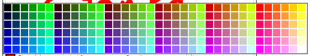
I want to show you algorythm that builds such palette.


int x,y, count;
                x = y = count = 0;

                for (int r = 0; r <= 255; r += 51)
                {
                    for (int g = 0; g <= 255; g += 51)
                    {
                        for (int b = 0; b <= 255; b += 51)
                        {
                            Border brd = new Border()
                            {
                                Background = new SolidColorBrush(Color.FromArgb(255, (byte)r, (byte)g, (byte)b)),
                                BorderThickness = new Thickness(0),
                                Margin = new Thickness(1),
                                Width = 15,
                                Height = 15,
                                Cursor = Cursors.Hand
                            };
                            brd.MouseLeftButtonDown += delegate
                            {
                                SelectedColor = ((SolidColorBrush)brd.Background).Color;
                                ppColors.IsOpen = false;
                            };
                            count++;
                            cnvColors.Children.Add(brd);
                            Canvas.SetLeft(brd, x);
                            Canvas.SetTop(brd, y);
                            if (count >= 6)
                            {
                                y = 0;
                                x += 17;
                                count = 0;
                            }
                            else
                            {
                                y += 17;
                            }
                        }
                    }
                } 
 
The idea is to go through all possible sets of R and G and B values and add border with such RGB to container. Since R,G and B are bytes, their max is 255. So, total count of colors will be 255*255*255 = 16581375....Heh, too much :) So, lets reduce number of steps: and increase component values with 51 instead of 1. So, for one color component we will have only 255/51=5 values.
Total number of colors is 5*5*5 = 125. It's ok for this application. To make palette looks nice I choose offset values, that the same colors was in the same column and in the same row.

Results

In this application, I tried to create easy to use and easy to modify control, that allows you to create simple image editor in your application. You can use it as-is, or re-use only some parts of it: for example ColorPicker.
Also, here you can get some interesting information about working with geometries, mouse capturing and oprimization by rendering a lot of controls into image.

Monday, April 25, 2011

Style Browser for WPF

Introduction

In this article I will show you simple application that can help you navigate in mass of your XAML styles. You can download sources from attachments to current article

My original article on codeproject, where you can download sources: http://www.codeproject.com/KB/WPF/stylebrowser.aspx

Background 

I am sure each WPF developer have met following problem: a lot of styles...a lot of images, brushes, different textboxes and textblocks. And sometimes it is hard to find resource key you need. This problem is often met in large WPF projects, with a lot of custom controls. When there are multiple developers - it can be much more hard! But for some cases - there is rather simple solution. Application described in this article can help you to make this process easier. Using StyleBrowser you can select XAML and look "inside" it. Application will show you all styles, images and brushes are stored in specified XAML file.
Also this application can be used when you want to use styles that you have created before and dony remember what exactly is inside XAML file. Just open XAML, find needed style and use it! 

Using the application

When you open application you see follwoing screen:

 Push "Select XAML" and open-dialog will appears on your desktop. Select XAML file with styles and press OK. If XAML is able to parse, then you will see something like this:

In the middle of application there is TabControl with number of tabs. Each tabs is a group of some styles from XAML. On screenshot tab "Buttons" is opened and you can see buttons from XAML.  "Sample content" - is added automatically to each control that has "Content" property. Reflection is used for detection.  To the right there is style Key and its classname. All styles are sorted A-Z.
Also, there is 2 usefull features, that can help you. You can select background, because some styles are white, some black...some black and white :) . Right now there is only 3 predefined colors. Black, white and gray. I think that it will be something like color picker in the future.
The second feature is searching. Just type any word in search textbox and you will see only styles that matches searched text. Color and search is show on following image

 Last interesing usefull feature is that you can see XAML. Just click on "XAML" button to the right of style you want to see. But this feature has one disadvantage at current step. It show you XAML with fully qualified classnames and also XML namespaces are added. But simple XAML's looks nice and can be usefull.


Code screenshots  

Lets make a short trip through code and take look ate how it works. At the beginning OpenDialog is used to selected file.
To parse XAML I simply use following code:

XamlReader reader = new XamlReader();
             FileStream stream = new FileStream(dlg.FileName, FileMode.Open);
             Uri uri = new Uri((new FileInfo(dlg.FileName)).Directory.FullName + "\\");
             object xaml = reader.LoadAsync(stream, new ParserContext() { BaseUri = uri });
 
We have to specify BaseUri here, so parser is able to process relative paths to images or any other files, if they exists in XAML. 
This code also has disadvantage. If some of tag cant be parsed, XAML will not be read at all. So here we got restrictions: XAML should contains only namespaces defined by default in .Net version sources was compilled in. My solution uses .Net 4.0.
Also, you should be carefull with images pathes. 
Next step is to fill resources of current window with loaded styles. We need it because there can be some styles that use another styles from that XAML. If we dont copy XAML to the resources -then referenced XAML will not loaded.

this.Resources.Clear();
                    if (xaml is ResourceDictionary)
                    {
                        foreach (DictionaryEntry item in (xaml as ResourceDictionary))
                        {
                            this.Resources.Add(item.Key, item.Value);
                            entries.Add(item);                           
                        }
                    }
Right now this code has another bad thing: sometimes some control of  main window that has style in resources will change it's look, even if  this control is not in preview area. I am going to fix it in future.
So, we have collection on styles, brushes and images, We can do everything with it. Sort, group, etc. In my app styles a sorted A-Z.
Next task is go through each item in collection and create preview in related tab control.

foreach (var item in list.OrderBy(e => e.Key.ToString()))
            {
                StyleItem styleItem = null;
                DictionaryEntry entry = (DictionaryEntry)item;
                if (entry.Value is Style)
                {
                    Style style = entry.Value as Style;
                    Type type = style.TargetType;
                    object obj = Activator.CreateInstance(type); 
if (obj is AnimationTimeline) continue;

                    styleItem = new StyleItem(obj as FrameworkElement, style, type, entry.Key.ToString());

                    if (type == typeof(Button) || type == typeof(ToggleButton))
                    {
                        buttonsPanel.Children.Add(styleItem);
                    } 
 
StyleItem is custom control that represent style preview. Each DictionaryEntry has Key and Value (as ususal has Dictionary :) ). Key is a x:Key attribute from XAML. Value is an content of XML-element.
We have to check what type  value is, because, for example you cant apply Style property if current item is an Image. Also, we need to skip any Animation, because seems it is impossible to create universal preview for animations. If item is brush or image I just assign background of preview as image or brush.
If item is style, there are 3 important lines, which extract style, object type and create instance of extracted type.

Style style = entry.Value as Style;
                    Type type = style.TargetType;
                    object obj = Activator.CreateInstance(type); 
 
Then StyleItem use this info to create related preview item in TabControl.
Another interesting thing is how preview XAML text is created.

string xaml;
                    try
                    {
                        xaml = XamlWriter.Save(entry.Value).Replace(">", ">\n").NormalizeXaml();
                    }
                    catch { xaml = "XAML cannot be parsed"; }
 
Why "Replace" method is used here? Because Save() return string without line breaks. So, I decided to insert line break after each ">".
Also, there is extension method for String:

NormalizeXaml() 
 
This method insert spaces at the beginning of each line depends on it deep in XML. I am not sure if I should show this method implementation in this article. 

Restrictions and future  

As for now, there is a number of issues in this application. But if you will find it usefull, please tell me about that. If developers will like what this app doing - I will work on it and add new usefull features and fix current issues.
In future I am going to:
- Skip styles with errors
- Add DLL's with resources
- Feature to add different XAML's. For example if one XAML has references to styles defined in another
- Add color picker to choose custom background color
- Clean XAML source viewer from namespaces and fullqualified pathes
- Create more smart object creator. For example: use predefined content template for menus, tabcontrols and other controls that has complicate content
- Make preview areas resizable. For example small text need small rectangle, but slider or image sometimes need huge area
- Maybe you will tell me abot any interestinf features


Monday, April 4, 2011

JQuery plugin for radiobuttons.

Hi everybody!

Since my blog is about .Net, here will be ASP.Net related themes including Javascript. And today I wanna share with you small plugin that allows youto create set of buttons with behavior like radio-buttons. Each button has hyperlink inside it, where user should click to select button.

I give this plugin name "buttonset". Main idea is to change elements style when they are selected or deselected.

This plugin has 2 methods: Initialize and GetSelected. First one get input options and initialize 'Click' handler for elements. Second one returns Id of selected element.

To init plugin, you need call:
  jQuery('#container').buttonset('Initialize');
, where container is parent element for all element which represent radiobuttons. For example:

<div id="container">
    <div class="selectedClass">
        <a id="Link1" href="">Link1</a>
    </div>
    <div class="defaultClass">
        <a id="Link2" href="">Link2</a>
    </div>
</div>

How it works. When user click on any element (hyperlink inside element which represent radiobutton), plugin go through all childred of parent container. If currently clicked element's Id equals ti Id of element in current .each step - then this Id is selected, otherwise it is deselected. This is like class toggling.To get selected Id, just check each element for it's class and return element with .selectedClass
Plugin source:

(function ($) {

    var methods = {

        Initialize: function () {

            $(this).delegate("a", "click", function () {
                var selectedId = $(this).attr('id');
                var container = $(this).parent().parent().parent();
                $(container).children("div").each(function () {
                    var currentId = $(this).find("a").attr("id");
                    if (selectedId == currentId) {
                        $(this).removeClass("defaultClass").addClass("selectedClass");
                    }
                    else {
                        $(this).removeClass("selectedClass").addClass("defaultClass");
                    }
                });
                return false;
            });
        },

        GetSelected: function () {
            var selectedId;

            $(this).find("a").each(function () {
                var container = $(this).parent().parent();
                $(container).children("div").each(function () {
                    var currentId = $(this).find("a").attr("id");
                    if ($(this).attr("class") == "selectedClass") selectedId = currentId;
                });
            });
            return selectedId;
        }
    };

    jQuery.fn.buttonset = function (method) {
        var buttonset = this;


        // Method calling logic
        if (methods[method]) {
            return methods[method].apply(this, Array.prototype.slice.call(arguments, 1));
        } else if (typeof method === 'object' || !method) {
            return methods.Initialize.apply(this, arguments);
        } else {
            $.error('Method ' + method + ' does not exist on jQuery.buttonset');
        }
    };
})(jQuery)


Sunday, April 3, 2011

Custom ShowDialog() method

In my first article I have considered DispatcherFrame. I have tried to look in-depth of DispatcherFrame, showed some IL sources of .Net and tried to explain what it is.
While reading MSDN about threading model, I met a section, which said that PushFrame() can be used to create something like WPF dialog windows. That windows take control after calling ShowDialog() and doesn’t return control to parent window until closed. So, I wondered, how to create such window?

Custom ShowModal()

For the first, I tried to open new window in separate thread. It works! But when I clicked on suspended parent window for 5-10 times, that window get “Not responded”. Not good!
I was really wondered how to block parent window, but prevent it from suspension. I thought about how to use DispatcherFrame here. Obviously, if main thread is blocked, then parent window will be also blocked, because of blocked dispatcher. So, there is no way to use PushFrame in such solution.
After that I decided to use Reflector to see how ShowDialog() is implemented in WPF. So, what I see? WINAPI used there to block each window in current thread.

<span lang="EN-US"></span>[SuppressUnmanagedCodeSecurity, 
SecurityCritical, DllImport("user32.dll", EntryPoint="EnableWindow", CharSet=CharSet.Auto)] 
public static extern bool IntEnableWindowNoThrow(HandleRef hWnd, bool enable); 
This method is called for each window with enable = false. As you guess solution becomes very closer. To implement my own ShowModal() I should perform following steps:
- Block parent window
- Add event handler on modal closed and unblock parent window inside this handler
- Show modal window and call PushFrame()
That’s it!

[DllImport("user32")]
        internal static extern bool EnableWindow(IntPtr hwnd, bool bEnable);

        public void ShowModal()
        {
            IntPtr handle = (new WindowInteropHelper 
(Application.Current.MainWindow)).Handle;
            EnableWindow(handle, false);

            DispatcherFrame frame = new DispatcherFrame();

            this.Closed += delegate
            {
                EnableWindow(handle, true);
                frame.Continue = false;
            };

            Show();
            Dispatcher.PushFrame(frame);
        }
 
First, we define extern method which uses WINAPI to enable/disable windows. Exactly that method used in WPF ShowDialog(). Than we blocks window, show modal and push new DispatcherFrame.
Why we have to use PushFrame() here? Answer is to prevent returning from ShowModal() method. When new frame is pushed, main loop suspended and new loop starts. This new loop processes system messages and execution point in main loop doesn’t go forward. When modal closed, DispatcherFrame.Continue = false, and this frame is exited. And after that application back to normal flow
This approach has no any obvious advantages in comparing with ShowDialog() method. Dialog behaviour is totally the same.

The one benefit, that is provided by this way is full control on blocking and unblocking windows from modal window. Say, what if u need to block only 2 of 4 active windows? Or unblock window while dialog is showed? It could be problematically with classic ShowDialog() method. Ofcourse, you can use WinAPI, but this is not so obviously as with custom ShowModal() method.

Also, you can put windows blocking and unblocking command anywhere. Just put PushFrame() and frame.Continue = false, to places of code, where you wanna stop or continue default application flow, and you will get it. It can be usefull if you want to continue main frame flow without closing of modal window or otherwise dont continue it after closing.